
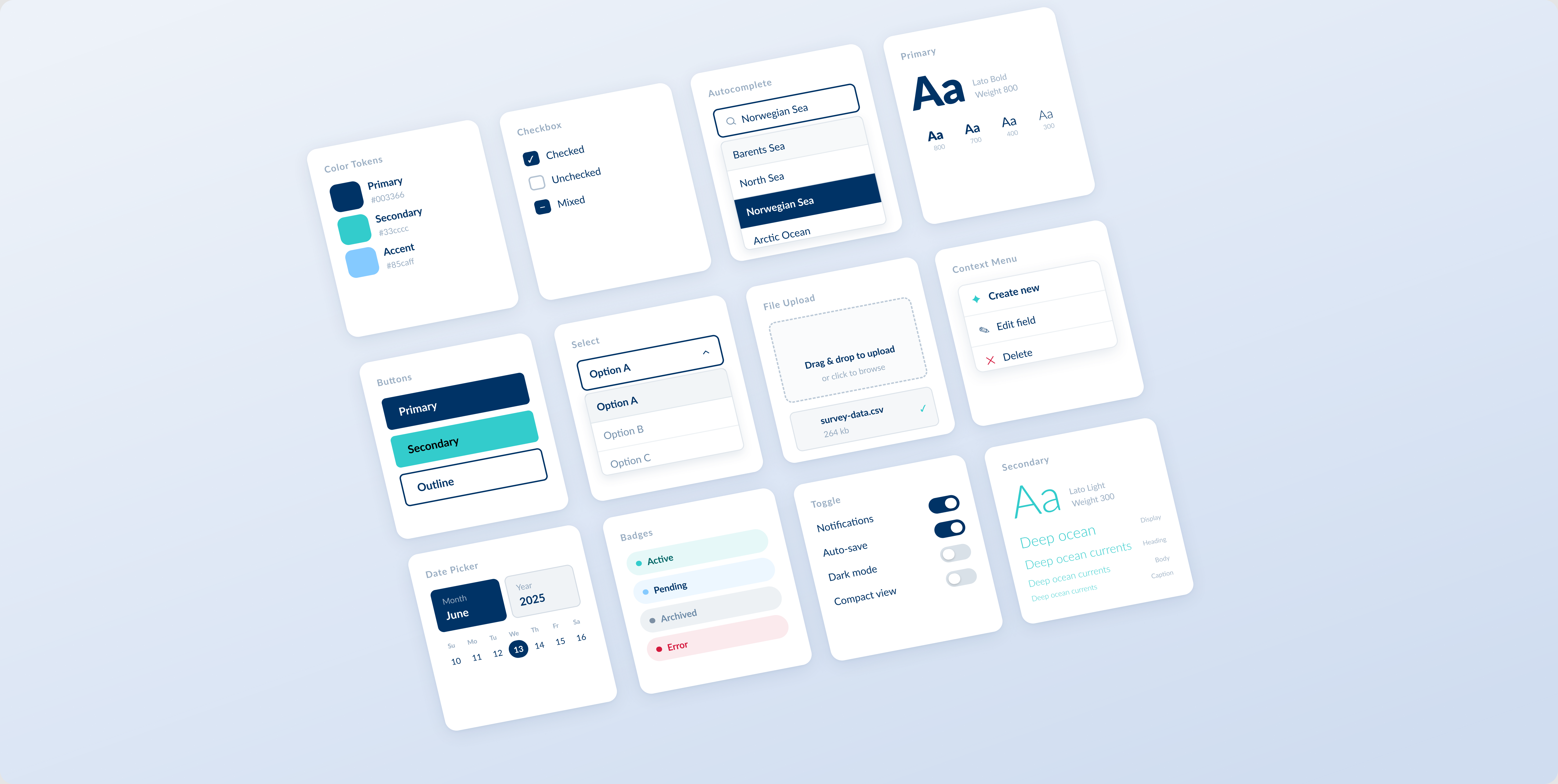
Scalable Design SystemBuilding HI’s first shared design system — one foundation for web and mobile, light and dark.
Institute of Marine Research
There was no shared design system — product teams built UI separately across web and mobile.
Institute of Marine Research
Scalable Design System
Building HI’s first shared design system — one foundation for web and mobile, light and dark.
- 30+
- Components
- 600+
- Design Tokens
- 6
- Breakpoints
- 2
- Color Modes
System at a Glance
Drag to compare dark and light themes
Button
Input
Badge
ActivePendingDraftReviewCompleteError
Dropdown
Norwegian seas
Barents Sea
Toggle
On
Off
Disabled
Loading
Typography
Aa4XL — Display
AaLG — Heading
AaBase — Body
AaSM — Caption
Color
Primary
Secondary
Accent
Neutral
Surface
Table
| # | Name | Status | Depth |
|---|---|---|---|
| 001 | Alpha | Active | 842 m |
| 002 | Beta | Pending | 1,240 m |
Chart
Design Principles
Token-first
Every value references a named token — no raw hex or hardcoded px.
Accessible
WCAG AA contrast ratios enforced at the token level.
Scalable
Tokens and components extend without breaking existing usage.
Consistent
One pattern per use case, documented with clear rationale.