

LIKESTLLING
INTEGRERING
MANGFOLD


Client
LIM (Likestilling, Integrering, Mangfold) is a non-governmental organisation that works to promote immigrants' participation, trust and belonging to Norwegian society. The organisation wishes to act as a speaker of liberal and secular values and counteract segregation of society on ethnic or religious grounds. LIMs wants a new logo and website.
2018
ROLE
Graphic design
Branding
Web developing
Concept developing
Behind the logo
Created a Brand Identity that emphasises that people are the focus of the organisation. The logo uses rounded edges to create a friendly, humanly and warm feeling. With "i", the people represent the center of LIM, and the heart-shaped m illustrates LIM's full-fledged approach and belief in their values.


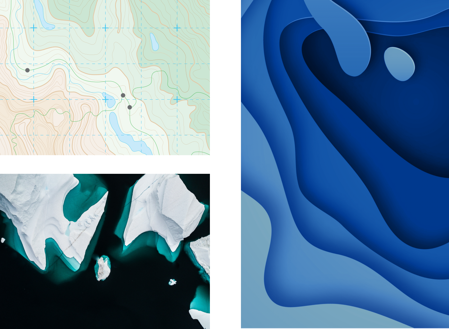
Behind the support pattern and colors
A simple color palette that has a deep sky and ocean blue as its main color that represent the nature of Norway. And combine the topography lines with the different shades show the depth of the project as the depth of iceberg that beneath the surface. The red and green support colors connect with blue to create a bold and strong visual identity that represents LIM's vision and message – containing bold, passionate and diversity.
Present the value of client


Using of web editor
I also created a simple website on Squarespace for client, so it's also easier for them to write new article and create events.
A simple blog
